Variable-font text that reacts to the cursor, and five more text animations
Updated November 12, 2026
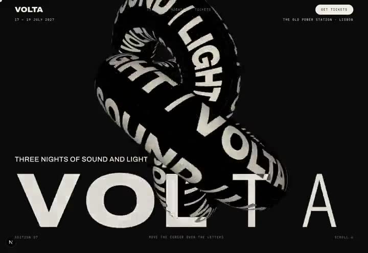
Use a variable font that has both a weight and a width axis, put each letter in its own element, and on every animation frame set that letter's `font-variation-settings` from its distance to the pointer: thin and condensed when far, heavy and wide when close. Ease the values so they glide rather than snap.
The detail that makes it work is layout. Give every letter an equal-width cell so the word never reflows while its glyphs change shape, and size the font so the widest, heaviest glyph still fits its cell.
1. The pressure wordmark
Pick a variable font with a wide range, for example Archivo, whose weight runs 100 to 900 and width 62 to 125. In Next.js request the extra axis explicitly with `axes: ["wdth"]`, or only weight is loaded.
Render the word as a flex row of spans with `flex: 1 1 0` and centred text. In a requestAnimationFrame loop, measure each span, turn its distance to the pointer into a number from 0 to 1, smooth it, and write `"wght" 150–900, "wdth" 62–125`. On touch screens there is no pointer, so run a sine wave through the letters instead.
2. Words that fill on scroll
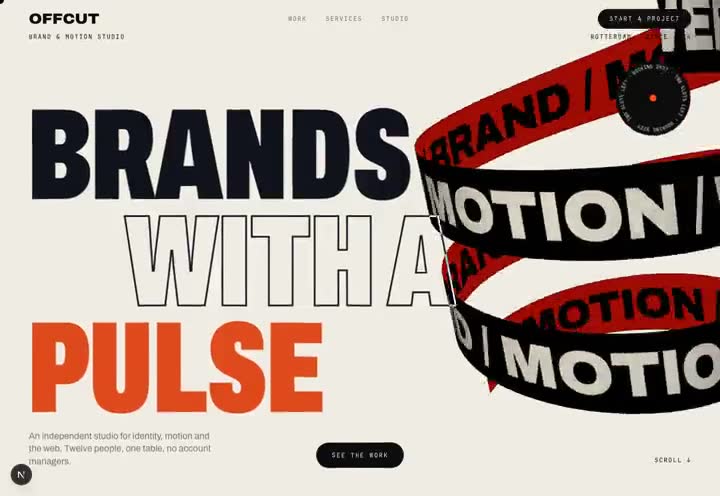
Split the paragraph into words. Start each as an outline: transparent fill with a one-pixel `-webkit-text-stroke`. Scrub a GSAP timeline with ScrollTrigger so each word's fill colour arrives as it passes the middle of the screen. Pick a few words to fill in the accent colour and widen on the width axis.
3. Character reveals, scramble and odometer
GSAP SplitText with `mask: "chars"` wraps each character in a clipping box, so a simple `yPercent: 110` to 0 with a stagger gives the classic rise-from-below headline. ScrambleTextPlugin suits small mono labels. For big numbers, stack the digits 0 to 9 in a column inside an overflow-hidden cell and translate the column, which reads as an odometer.
4. Ghost trails from scroll speed
Keep one smoothed scroll-velocity number for the whole page. Clone a headline twice, absolutely positioned on top of itself at low opacity, and offset the clones by the velocity. At rest they sit exactly behind the text; scroll hard and the word smears in the direction of travel.
5. Text wrapped around a 3D shape
Draw the words onto a 2D canvas, use it as a repeating Three.js texture, and map it onto a torus knot or cylinder. Slide alternate rows in opposite directions in the fragment shader by offsetting the U coordinate with time. Wait for `document.fonts.load()` before drawing the canvas, or the texture uses the fallback font.
Put the WebGL canvas behind the page at `z-index: -1` and give the DOM headline `mix-blend-mode: difference`; the type then inverts wherever the shape passes behind it. The page background must be on the html element only, because a background on body paints over the canvas.
6. Keep it accessible and fast
The words must stay real text. Put an `aria-label` on the wordmark and `aria-hidden` on the split letters. Skip the time-based motion for visitors who ask for reduced motion. Stop each wordmark's loop with an IntersectionObserver while it is off screen, since animating font axes triggers layout.
Frequently asked
Which fonts work for cursor-reactive text?
Any variable font with at least a weight axis; a width axis makes the effect far stronger. Archivo, Roboto Flex and Anybody are free options with both axes.
Is animating font-variation-settings bad for performance?
It triggers layout for the affected text, so keep it to short display words, give letters fixed-width cells, and pause the loop when the word is off screen. Used that way it holds 60 frames a second on phones.
Is GSAP SplitText free to use?
Yes. From GSAP 3.13 all plugins, including SplitText and ScrambleText, are free for commercial projects.
Is there a finished example?
Yes. The Volta template in this studio uses every technique on this page, and its full Claude Code build prompt is free on the template page.