Kinetic typography & text-animation website templates
Kinetic typography means the type itself carries the motion: letters change weight and width, words fill as you scroll, headlines arrive character by character. The templates here make that the main event instead of decoration on top of a video.
Offcut, a studio portfolio, has a headline that stretches like elastic toward the cursor and a 3D ribbon of running text. Volta is a music festival site whose wordmark is a variable font that swells under the cursor, with a 3D knot wrapped in moving text behind it, outlined words that fill on scroll, an odometer for the night numbers and a pinned gallery of giant words. The others on this page treat type more quietly: headlines that rise word by word out of masks, paragraphs that light up as you scroll, extruded display lettering, and a wordmark that burns through a plate.
All are Next.js 16 + TypeScript + Tailwind apps animated with GSAP. Volta uses its SplitText and ScrambleText plugins, which are now free for commercial use. Each has a free Claude Code prompt, and the tested source is included in Full Access.
5 templates
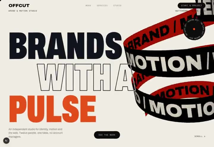
Offcut
Source code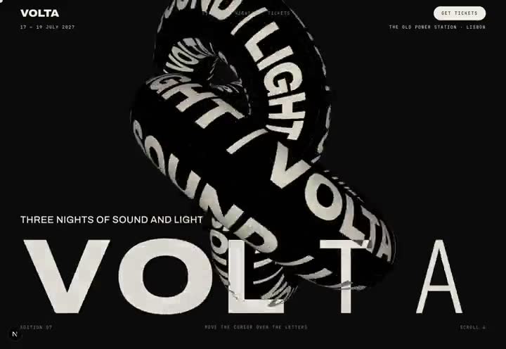
Volta
Source code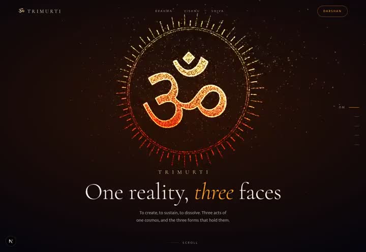
Trimurti
Source code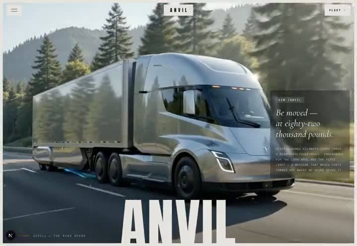
Anvil
Source code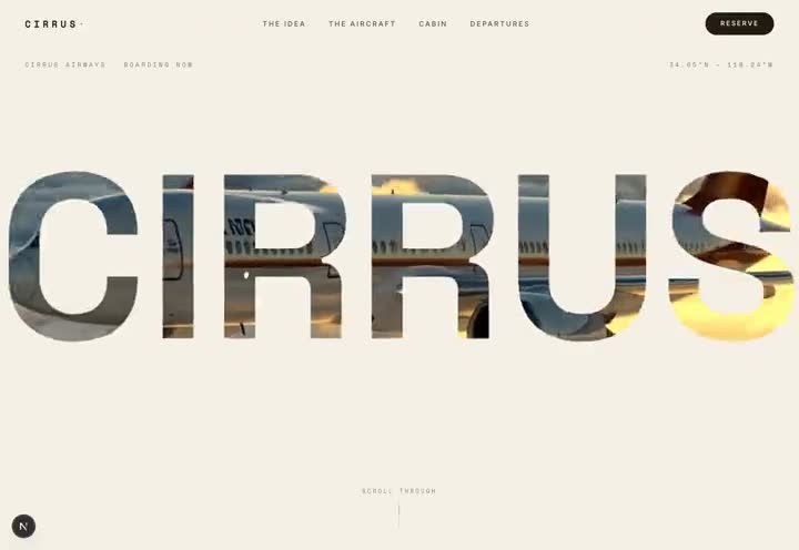
Cirrus
Source codeQuestions
What is kinetic typography on a website?
It is text that moves as part of the design: letters that change weight or width, words that reveal or fill as the page scrolls, and headlines that react to the cursor. On the web it is usually built with variable fonts, GSAP SplitText and, for 3D text, Three.js.
How do you make text react to the cursor?
Use a variable font with weight and width axes, wrap each letter in its own element, and on every animation frame set that letter's font-variation-settings from its distance to the pointer. Keep each letter in a fixed-width cell so the word does not reflow.
Is GSAP SplitText free?
Yes. Since GSAP 3.13 every plugin, including SplitText and ScrambleText, is free for commercial use and ships in the standard gsap package.
Do text-animation templates hurt accessibility or SEO?
Not if they are built properly. The words stay real text in the page, split letters are hidden from screen readers behind an aria-label, and visitors who ask for reduced motion get the text without the animation.